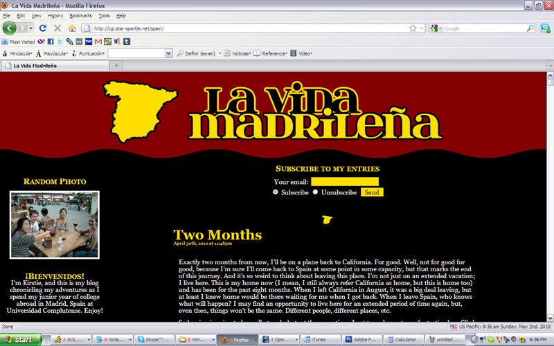
New layout!
Hooray, a new layout for the blog! I still liked the appearance of the old one, but it wasn’t compatible with a lot of screen resolutions, and the black on bright red text was probably rather difficult to read for some people, so this one, though a bit boring, should be better for those reasons.

I’ve also added a random photo widget to the sidebar (click on the image to see a larger version), fixed comment formatting, solved a few little bugs, changed a couple of other things, and may soon be adding my Facebook photo galleries to this site so you don’t have to go to Facebook to see them (although since almost everyone who reads this is on Facebook anyway, I’m not sure that matters).
Let me know if you see any problems I may have missed. Is this one easier to read for you guys? Does it show up correctly in your browser?


Looks good! Nice going!
Hi Kirstie Kate. I like the new layout. While I liked the old layout, the new one is easier to read on my iPhone. I like the random picture too. Thanks for doing the blog – I enjoy seeing it! Love you!